I recently contacted the core team about a logo design I came up with. Bruce kindly directed me towards this group.
As you can see in the forwarded message below, logo design is a bit of a hobby for me. If you and the community agree that the design has potential, I would be happy to iterate on the design based on your feedback.
I would email the Postgres advocacy list, pgsql-advocacy@postgresql.org, and see what they think about it. It is certainly a new direction in design and has potential.
On Fri, Nov 22, 2019 at 12:37:29AM -0500, BFarrell915 wrote:
Hello PostgreSQL Core Team,
My name is Bryan, I’m a developer by trade, and I recently started using PostgreSQL in a Django project I’m working on!
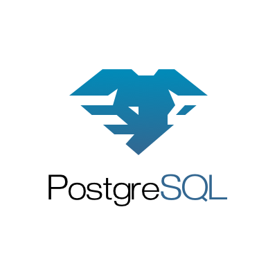
Logo design is also somewhat of a hobby for me, and I enjoy researching the history behind logos and the like. Naturally, I started researching the history behind the PostgreSQL logo soon after I started using it. I came across this article <https://www.vertabelo.com/blog/the-history-of-slonik-the-postgresql-elephant-logo> which gives a fairly detailed history of Slonik and the choices behind its creation. In that article, I also came across this gem (pun intended).
While not what I would consider an outstanding logo, I really liked the idea of using a diamond to reinforce the notion of a strong, reliable product. So I wondered how I might design a logo that looked modern and sleek, while also incorporating that idea.
Here is what I came up with.
While definitely more abstract than the current logo, I think the elephant is easily recognizable. The rigid shapes were designed to mimic the luster of a diamond, and they further reinforce that solid, dependable feeling. The horizontal striations outline the shape of the elephant’s ears and are also somewhat reminiscent of common database icons <https://commons.wikimedia.org/wiki/Category:Database_icons>. I don’t dislike the current design of Slonik, but it does seem a bit outdated (16 years old!) and it does lose some of its detail at smaller sizes.
I know this is a bit unusual, the community is probably fairly attached to the current iteration of Slonik, and a logo redesign is most likely not on your minds. But if you (and the community) like the design, it’s yours. I won’t ask for any kind of compensation; all I'll ask is attribution.
I’d be happy to hear your thoughts, and would be open to iterating on the design based on your and/or the community's feedback. I can also provide high quality vector assets and variations on the logo (monochrome, various sizes, horizontal lockup, etc.). Please feel free to email me back at your convenience.