On Wed, May 3, 2017 at 11:06 PM, Shirley Wang <swang@pivotal.io> wrote:
So to summarise:
- I'm happy to see the number of grays reduced as proposed.
- I don't like the dark gray column headers.
- I think the column and row headers should be the same colour.
- I think we should review the bluish-gray used for the codemirror gutter (though, it looks fine for the alternate rows)
- We should use a light-gray for the disabled codemirror, with slightly faded text.
What do you think?
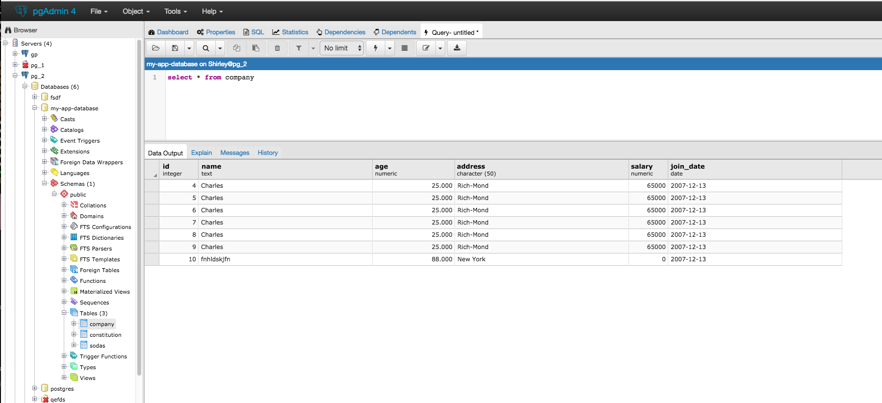
Gotcha. Here's the query tool with the same grey as the row header.
I quite like this grey as a header.
Yes, me too.
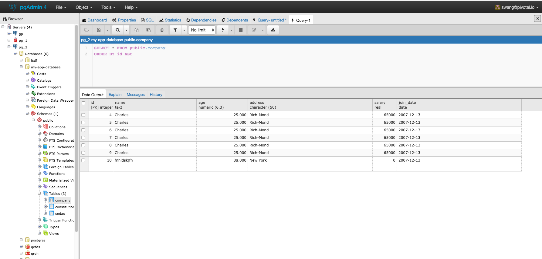
And in the 'View all Data'
I made the codemirror and codemirror gutter the same color with a 50% opacity on the text. It looks like its lighter in the 'View all data' mockup, but that's because the codemirror being grey makes the gutter lose contrast.
Works for me :-)
I'm not sure why it looks bluish grey for you, it's a neutral grey both times (#f9f9f9). Perhaps try editing the color in Chrome Inspector to see if it makes a difference?