Thread: Proposed HTML Documentation Styles
Hi,

As part of the effort to modernize the look and feel of PostgreSQL.org
and associated web projects, Sarah & I have worked on applying the new
styles to the documentation. The main goals of the project were:

- To have the documentation styles match that of the main website
- To make the documentation easier to view on mobile devices
- To set up the web-based documentation for future usability changes and
improvements

Other than reversing how the versions are display at the top of the
website, we did not change any of the documentation structure and do not
intend to as part of this version of the project.

We have created a prototype of the new styles that can be viewed here,
with the credentials below:

    http://174.138.60.30/docs/
    pgdocs / newstyles

When browsing through this site, please note:

- All interactions are confined to the "/docs" folder
- Not all of the docs are loaded and they are not all the latest
versions - this is just for beta testing purposes
- Search in the prototype does not work

We are looking for feedback in the following areas:

- Things that may have degraded the user experience, e.g. things that
are difficult to read
- Visual bugs and errors

Our goal is to launch these changes with the upcoming major release, so
we appreciate your diligence in providing helpful feedback so we can
provide the best possible experience.

Thanks,

Jonathan
Attachment
čt 4. 10. 2018 v 17:50 odesílatel Jonathan S. Katz <jkatz@postgresql.org> napsal:
Hi,
As part of the effort to modernize the look and feel of PostgreSQL.org
and associated web projects, Sarah & I have worked on applying the new
styles to the documentation. The main goals of the project were:
- To have the documentation styles match that of the main website
- To make the documentation easier to view on mobile devices
- To set up the web-based documentation for future usability changes and
improvements
Other than reversing how the versions are display at the top of the
website, we did not change any of the documentation structure and do not
intend to as part of this version of the project.
We have created a prototype of the new styles that can be viewed here,
with the credentials below:
http://174.138.60.30/docs/
pgdocs / newstyles
When browsing through this site, please note:
- All interactions are confined to the "/docs" folder
- Not all of the docs are loaded and they are not all the latest
versions - this is just for beta testing purposes
- Search in the prototype does not work
We are looking for feedback in the following areas:
- Things that may have degraded the user experience, e.g. things that
are difficult to read
- Visual bugs and errors
When I am going to document, then I see (about 0.5 sec) big PostgreSQL logo. It is not pleasant effect.
I don't like table style - middle vertical line is too black
Used colour palette is maybe too red based.
All my notes are subjective, just my feeling
Regards
Pavel
Our goal is to launch these changes with the upcoming major release, so
we appreciate your diligence in providing helpful feedback so we can
provide the best possible experience.
Thanks,
Jonathan
On 2018-Oct-04, Pavel Stehule wrote:

> čt 4. 10. 2018 v 17:50 odesílatel Jonathan S. Katz <jkatz@postgresql.org>
> napsal:
>
> When I am going to document, then I see (about 0.5 sec) big PostgreSQL
> logo. It is not pleasant effect.
>
> I don't like table style - middle vertical line is too black
>
> Used colour palette is maybe too red based.

Yeah, it's heavily red and I didn't like that very much either, though I
can live with it if everyone else loves it.

This TOC looks a bit odd, with those bold black elements amongst all
that red: http://174.138.60.30/docs/10/static/ecpg.html  I suppose these
should just be bold without changing the color.

This page http://174.138.60.30/docs/9.4/static/libpq-connect.html
has some keywords inside "Warning" and "Note" boxes. Those keywords
acquire a gray background instead of inheriting the background color of
the box, as in the original stylesheets.  Really odd-looking.

Cheers

--
Álvaro Herrera                https://www.2ndQuadrant.com/
PostgreSQL Development, 24x7 Support, Remote DBA, Training & Services
Hi Pavel,

On 10/4/18 12:02 PM, Pavel Stehule wrote:

> When I am going to document, then I see (about 0.5 sec) big PostgreSQL
> logo. It is not pleasant effect.

That's cache related - we won't need to worry about that on the
production site.

>
> I don't like table style - middle vertical line is too black
>
> Used colour palette is maybe too red based.
>
> All my notes are subjective, just my feeling

Thanks for your feedback!

Jonathan
Attachment
On 10/4/18 12:28 PM, Alvaro Herrera wrote:
> On 2018-Oct-04, Pavel Stehule wrote:
>
>> čt 4. 10. 2018 v 17:50 odesílatel Jonathan S. Katz <jkatz@postgresql.org>
>> napsal:
>>
>> When I am going to document, then I see (about 0.5 sec) big PostgreSQL
>> logo. It is not pleasant effect.
>>
>> I don't like table style - middle vertical line is too black
>>
>> Used colour palette is maybe too red based.
>
> Yeah, it's heavily red and I didn't like that very much either, though I
> can live with it if everyone else loves it.

We can always see if we can find something more palatable. In some
earlier testing there were some issues with the blue, but perhaps there
are some better ways to achieve the proper PostgreSQL color palette.

>
> This TOC looks a bit odd, with those bold black elements amongst all
> that red: http://174.138.60.30/docs/10/static/ecpg.html  I suppose these
> should just be bold without changing the color.
>
> This page http://174.138.60.30/docs/9.4/static/libpq-connect.html
> has some keywords inside "Warning" and "Note" boxes. Those keywords
> acquire a gray background instead of inheriting the background color of
> the box, as in the original stylesheets.  Really odd-looking.

Thanks - both of the above have been noted and will be fixed.

Jonathan
Attachment
> On 4 Oct 2018, at 18:33, Jonathan S. Katz <jkatz@postgresql.org> wrote:
>
> On 10/4/18 12:28 PM, Alvaro Herrera wrote:

>> This page http://174.138.60.30/docs/9.4/static/libpq-connect.html
>> has some keywords inside "Warning" and "Note" boxes. Those keywords
>> acquire a gray background instead of inheriting the background color of
>> the box, as in the original stylesheets.  Really odd-looking.
>
> Thanks - both of the above have been noted and will be fixed.

Not sure if it’s the same thing, but code blocks on Tip boxes no longer have a
separate background color - only an outline.  There is an example on the below
page:

    http://174.138.60.30/docs/11/static/functions-matching.html

cheers ./daniel
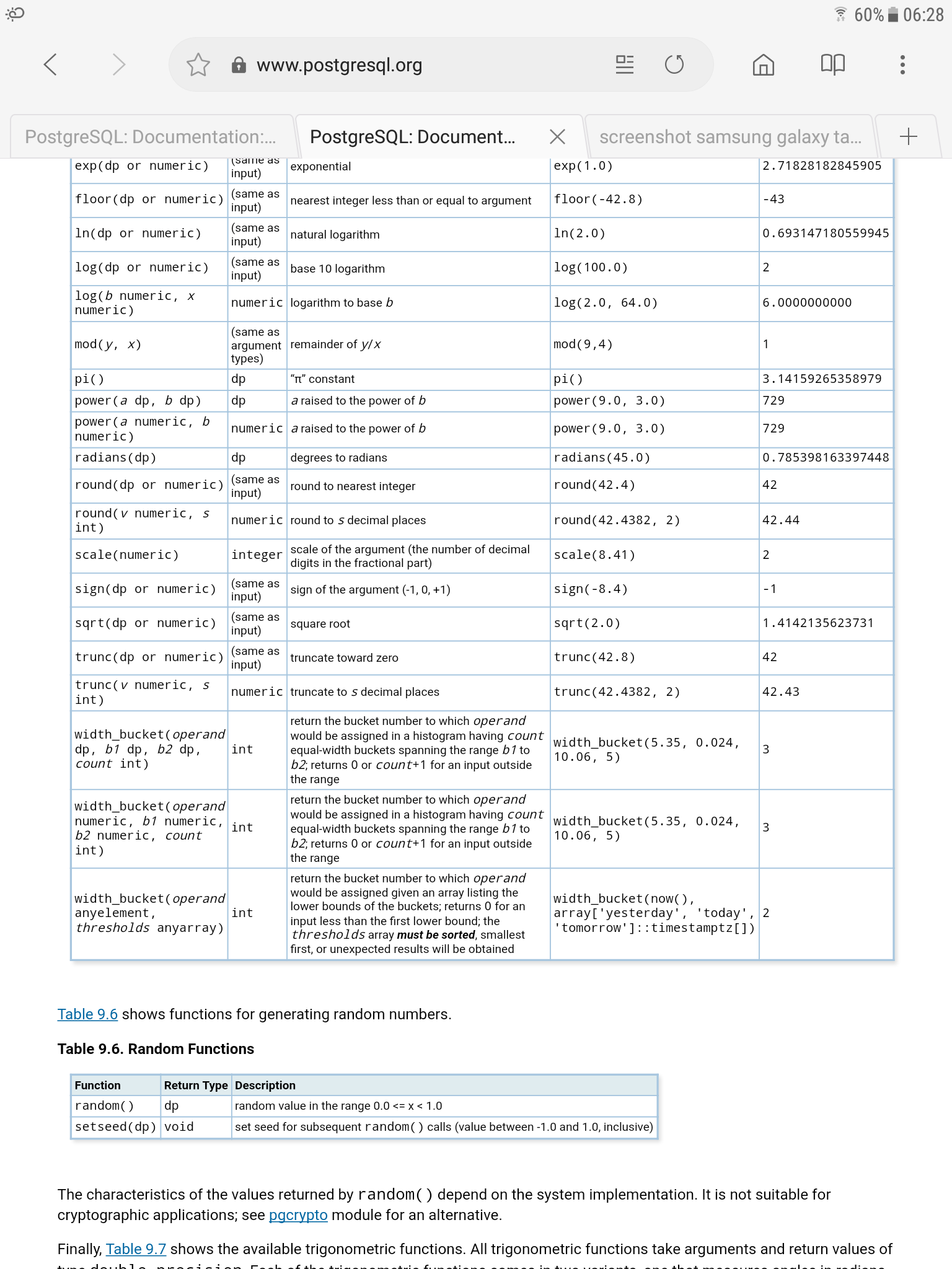
On Thu, 4 Oct 2018 at 16:50, Jonathan S. Katz <jkatz@postgresql.org> wrote:
> As part of the effort to modernize the look and feel of PostgreSQL.org
> and associated web projects, Sarah & I have worked on applying the new
> styles to the documentation.
>
> We are looking for feedback in the following areas:
>
> - Things that may have degraded the user experience, e.g. things that
> are difficult to read
> - Visual bugs and errors
>

There seems to be a problem with the layout some of the tables. For
example on this page:

http://174.138.60.30/docs/10/static/functions-math.html

the description column is far too narrow, leading to descriptions with
one or two words per line, spread over dozens of lines.

Regards,
Dean
On 10/4/18 12:33 PM, Jonathan S. Katz wrote:
> On 10/4/18 12:28 PM, Alvaro Herrera wrote:
>> This TOC looks a bit odd, with those bold black elements amongst all
>> that red: http://174.138.60.30/docs/10/static/ecpg.html  I suppose these
>> should just be bold without changing the color.
>>
>> This page http://174.138.60.30/docs/9.4/static/libpq-connect.html
>> has some keywords inside "Warning" and "Note" boxes. Those keywords
>> acquire a gray background instead of inheriting the background color of
>> the box, as in the original stylesheets.  Really odd-looking.
>
> Thanks - both of the above have been noted and will be fixed.

Updates for this have been pushed to the test website. Thanks for reporting!

Jonathan
Attachment
Hi Dean,

On 10/4/18 3:41 PM, Dean Rasheed wrote:
> On Thu, 4 Oct 2018 at 16:50, Jonathan S. Katz <jkatz@postgresql.org> wrote:
>> As part of the effort to modernize the look and feel of PostgreSQL.org
>> and associated web projects, Sarah & I have worked on applying the new
>> styles to the documentation.
>>
>> We are looking for feedback in the following areas:
>>
>> - Things that may have degraded the user experience, e.g. things that
>> are difficult to read
>> - Visual bugs and errors
>>
>
> There seems to be a problem with the layout some of the tables. For
> example on this page:
>
> http://174.138.60.30/docs/10/static/functions-math.html
>
> the description column is far too narrow, leading to descriptions with
> one or two words per line, spread over dozens of lines.

Sorry for the slow reply on this one - it took a little bit more time to
troubleshoot. This should now be fixed - please let me know if you are
still having issues.

Thanks,

Jonathan
On Tue, 9 Oct 2018, 02:38 Jonathan S. Katz, <jkatz@postgresql.org> wrote:
Hi Dean,
On 10/4/18 3:41 PM, Dean Rasheed wrote:
> On Thu, 4 Oct 2018 at 16:50, Jonathan S. Katz <jkatz@postgresql.org> wrote:
>> As part of the effort to modernize the look and feel of PostgreSQL.org
>> and associated web projects, Sarah & I have worked on applying the new
>> styles to the documentation.
>>
>> We are looking for feedback in the following areas:
>>
>> - Things that may have degraded the user experience, e.g. things that
>> are difficult to read
>> - Visual bugs and errors
>>
>
> There seems to be a problem with the layout some of the tables. For
> example on this page:
>
> http://174.138.60.30/docs/10/static/functions-math.html
>
> the description column is far too narrow, leading to descriptions with
> one or two words per line, spread over dozens of lines.
Sorry for the slow reply on this one - it took a little bit more time to
troubleshoot. This should now be fixed - please let me know if you are
still having issues.
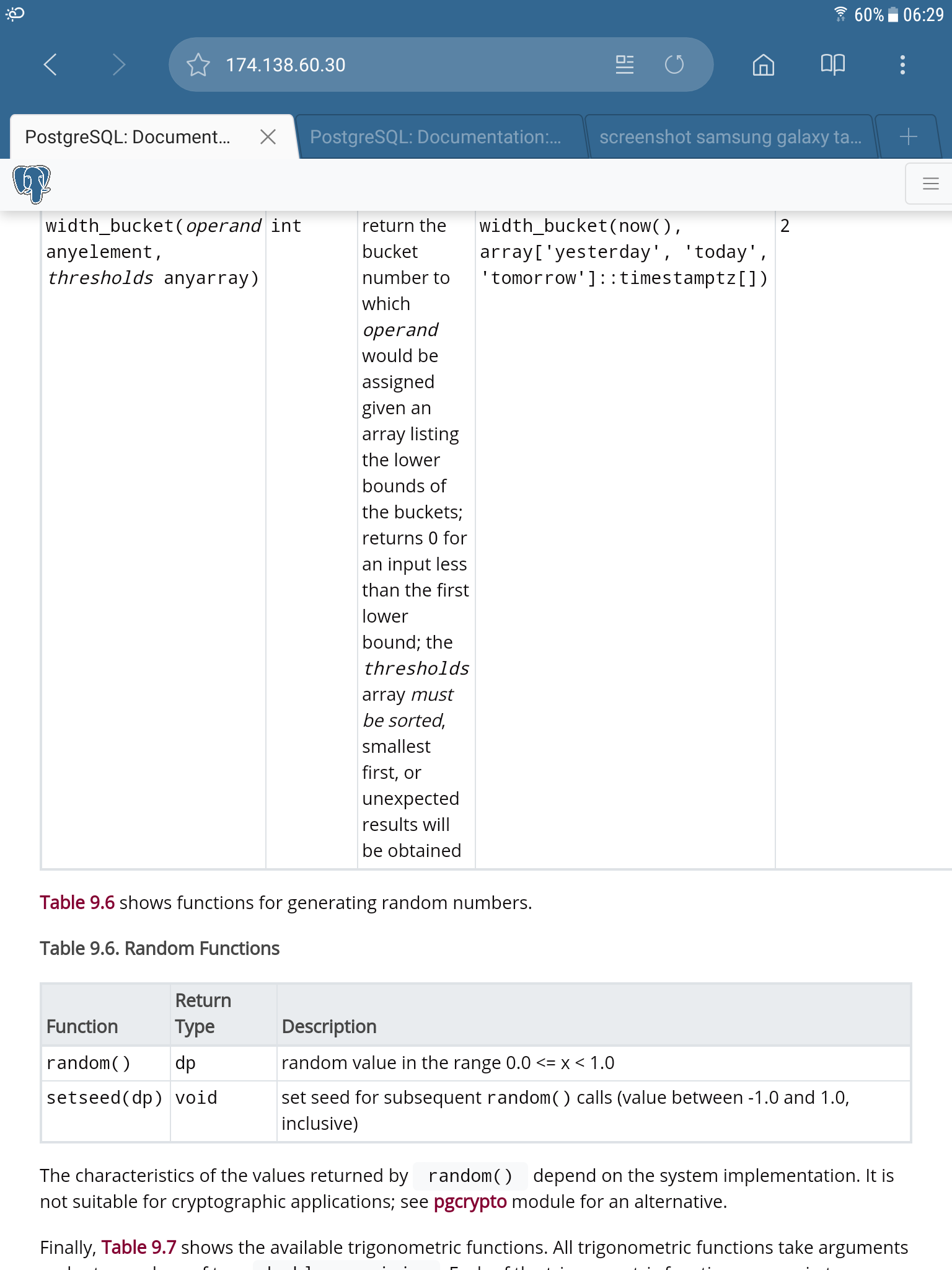
Thanks. That definitely improves things from a normal desktop browser. However, this still isn't ideal on smaller screens. For example, attached are screenshots taken from my Android tablet of the bottom of Table 9.5, comparing the current docs with the new ones.
Regards,
Dean
Attachment
On Thu, 11 Oct 2018 at 06:49, Dean Rasheed <dean.a.rasheed@gmail.com> wrote:
> For example, attached are screenshots taken from my Android tablet

For the record, that was a Samsung Galaxy Tab S2 8.0, with a screen
resolution of 2048x1536 and a device pixel ratio of 2.0, I think. So
the logical resolution is 1024x768, and in portrait mode, the logical
width is 768 pixels.

Regards,
Dean
Hi Dean,

On 10/11/18 3:01 AM, Dean Rasheed wrote:
> On Thu, 11 Oct 2018 at 06:49, Dean Rasheed <dean.a.rasheed@gmail.com> wrote:
>> For example, attached are screenshots taken from my Android tablet
>
> For the record, that was a Samsung Galaxy Tab S2 8.0, with a screen
> resolution of 2048x1536 and a device pixel ratio of 2.0, I think. So
> the logical resolution is 1024x768, and in portrait mode, the logical
> width is 768 pixels.

Unfortunately HTML tables are not great in mobile web. With that said,
we pushed up a change that should keep them from exploding as much to
the right. We've also bumped up the font-size slightly from the current
site so they could be slightly easier to read.

(Note: when testing in the browser, they appear to be illegible unless
you have super vision, but when on an actual device they are legible).

There is only so much we can do now without redesigning how the tables
are assembled.

Thanks again for your feedback!

Best,

Jonathan
Attachment
On Fri, 12 Oct 2018 at 03:03, Jonathan S. Katz <jkatz@postgresql.org> wrote:
> On 10/11/18 3:01 AM, Dean Rasheed wrote:
> > On Thu, 11 Oct 2018 at 06:49, Dean Rasheed <dean.a.rasheed@gmail.com> wrote:
> >> For example, attached are screenshots taken from my Android tablet
> >
> > For the record, that was a Samsung Galaxy Tab S2 8.0, with a screen
> > resolution of 2048x1536 and a device pixel ratio of 2.0, I think. So
> > the logical resolution is 1024x768, and in portrait mode, the logical
> > width is 768 pixels.
>
> Unfortunately HTML tables are not great in mobile web. With that said,
> we pushed up a change that should keep them from exploding as much to
> the right. We've also bumped up the font-size slightly from the current
> site so they could be slightly easier to read.
>
> (Note: when testing in the browser, they appear to be illegible unless
> you have super vision, but when on an actual device they are legible).
>
> There is only so much we can do now without redesigning how the tables
> are assembled.
>

Indeed. It's probably unrealistic to try to support really small
devices. I mentioned that particular one because there was a clear
regression from the old style. I have re-tested it and now it's much
better, so thanks for the fix.

Arguably, the font scaling in the @media CSS is now a little too
aggressive. IMO 60% rather than 50% is a little more readable for the
576-768px range, and 80% rather than 70% for the 769-992px range, but
that's a very subjective matter.

Regards,
Dean
On 10/4/18 11:50 AM, Jonathan S. Katz wrote:
> Hi,
>
> As part of the effort to modernize the look and feel of PostgreSQL.org
> and associated web projects, Sarah & I have worked on applying the new
> styles to the documentation. The main goals of the project were:
>
> - To have the documentation styles match that of the main website
> - To make the documentation easier to view on mobile devices
> - To set up the web-based documentation for future usability changes and
> improvements

Thank you everyone for your feedback. We launched the new documentation
styles this morning. Please let us know if you find any issues or have
any additional feedback.

Thanks,

Jonathan
Attachment
I am having problem with distinguishing tables from the description body without shadows. Without a shadow, stronger border and headings, like in old version, tables likes function parameter lists blends in with description paragraphs.
Hi Alexander,

On 10/16/18 2:44 PM, Alexander Romanenko wrote:
> I am having problem with distinguishing tables from the description body
> without shadows. Without a shadow, stronger border and headings,  like
> in old version, tables likes function parameter lists blends in with
> description paragraphs.

I went ahead and made a change to make the table section headers to
stand out more in the documentation and verified on the documentation
for all supported versions.

Thanks,

Jonathan
Attachment
Thanks for the response! The change did help a bit.
I guess no hope to make shadows come back? If not, I think I can find some browser extension that modifies <table> tag CSS for the docs domain to include it locally.
вт, 16 окт. 2018 г. в 20:23, Jonathan S. Katz <jkatz@postgresql.org>:
Hi Alexander,
On 10/16/18 2:44 PM, Alexander Romanenko wrote:
> I am having problem with distinguishing tables from the description body
> without shadows. Without a shadow, stronger border and headings, like
> in old version, tables likes function parameter lists blends in with
> description paragraphs.
I went ahead and made a change to make the table section headers to
stand out more in the documentation and verified on the documentation
for all supported versions.
Thanks,
Jonathan
On 10/16/18 5:44 PM, Jonathan S. Katz wrote:
On 10/4/18 11:50 AM, Jonathan S. Katz wrote:Hi, As part of the effort to modernize the look and feel of PostgreSQL.org and associated web projects, Sarah & I have worked on applying the new styles to the documentation. The main goals of the project were: - To have the documentation styles match that of the main website - To make the documentation easier to view on mobile devices - To set up the web-based documentation for future usability changes and improvementsThank you everyone for your feedback. We launched the new documentation styles this morning. Please let us know if you find any issues or have any additional feedback. Thanks, Jonathan
Hi Jonathan,
Thank you for modernizing doc styles!
I have noticed a small rendering issue in the Chrome browser. If you follow a link to a bookmark in a different page, it's hidden below the website header. Links within the same page and section-level links appear to work fine.
The attached screenshot illustrates the result of navigating to the default_statistics_target description from the https://www.postgresql.org/docs/10/static/planner-stats.html page.
I have not tested this thoroughly, but I got the same result on my smartphone in Safari, while having no issues at all in Firefox on Ubuntu.
--
Liudmila Mantrova
Technical writer at Postgres Professional: http://www.postgrespro.com
The Russian Postgres Company
Attachment
On 2018-Oct-22, Liudmila Mantrova wrote:

> I have noticed a small rendering issue in the Chrome browser. If you follow
> a link to a bookmark in a different page, it's hidden below the website
> header. Links within the same page and section-level links appear to work
> fine.

Yeah, I see this effect too and it's very confusing.

--
Álvaro Herrera                https://www.2ndQuadrant.com/
PostgreSQL Development, 24x7 Support, Remote DBA, Training & Services
[Catching up on pg lists.]

When I view any doc page now, before seeing the page, a huge rendering
of the logo appears; it is then replaced with the actual page.

Perhaps the pages should use a smaller png than the 900x928 is now does?

-JimC
--
James Cloos <cloos@jhcloos.com>         OpenPGP: 0x997A9F17ED7DAEA6